It is a known fact that when designing a product, it has to be designed user-first. But what does this mean, and how do we do it? Simplicity and functionality are two of the most significant ideas to keep in mind when designing. Think of a time when you were trying to complete a task by using a new mobile website, but when you go to use the website you can’t figure out how it works, or it is too complicated to look at, etc. Chances are, you left that website or mobile app and went to search for a new one. This process is extremely common. “If users have to think about how to navigate, they’re more likely to disengage from the website, or close the app and look for a simpler solution” (“Mobile UX Design Principles and Best Practices”).
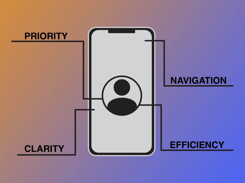
How do you go about making your product simple and functional for your user? There are a few things to keep in mind: priority, navigation, efficiency, clarity, and comprehension – to name a few. When a user comes to use your product, they should be able to complete their task at hand quickly and easily. If there is any struggle, it is likely to lead to frustration and the loss of the said user. “It’s up to the designer to make completing necessary tasks as easy as possible. Eliminating everything that isn’t absolutely vital to each task is a great place to start. Making necessary tasks simpler on a mobile interface is also key” (“Mobile UX Design Principles and Best Practices”). Tasks should be almost effortless to complete, navigating through the app should be simple and easy, inputting information should also be simple and easy. “Look for anything in the design that requires user effort (for example, reading text, entering data, making a decision), and look for alternatives” (“Mobile Design Best Practices”). The main idea when designing is to make using a process as effortless for the user as possible, a simple interface makes this possible. Part of making this effortless process is the placement of navigation. Think of how you hold your phone. “While a thumb can sweep most of the screen on most mobile screens, only a third of the screen is a genuinely effortless territory. This territory is called the natural thumb zone. Other zones require finger stretching or even changing the grip to reach them” (“A Guide for Mobile App Design: Best Practices for 2018 and Beyond”). In order for navigation to be easily reached, it needs to be placed in the neutral thumb zone. Things that are not meant to be tapped accidentally should be placed in harder-to-reach zones that require more stretch and reach.
Even the smallest of aspects that go into designing a product need to be thoroughly thought through with the user and simplicity in mind. If something is not as easily completed, brainstorm ideas on how to simplify it to make the overall experience for the user more pleasing. There is more to usability than meets the eye.
 CRyder Design
Leave a comment