
Introduction
User Experience (UX) design is largely based on research and psychology. Before designers can begin designing a product, they must first understand their user, the user’s needs, the user’s feelings, and the user’s interactions with the product. This understanding is gained through different research methods as well as a general understanding of consumer and design psychology. Design psychology can be defined as “a combination of neuroscience, cognitive psychology, social psychology, and human-computer interaction that approaches user experience design through the lens of human behavior” (“The Psychology of UX Design”).
However, identifying user feelings and needs is not always easy. Users may not always be able to explain the way that they feel, or even understand how a product makes them feel in the first place. The article “The New Science of Customer Emotions” provides an in-depth explanation of emotional motivators and how they play a role in user experience. The article explains, “We consider customers to be emotionally connected with a brand when it aligns with their motivations and helps them fulfill deep, often unconscious, desires.” This explains why users have a better experience with a product when their needs are met, yet they have a poor experience with a product when their needs are not met.
Defining user feelings and needs can be done through the process of creating a list of feeling and need statements. In this project, I analyzed two websites, Aeropostale and Hollister. To analyze these websites, I focused on 10 different aspects and created a feeling and need statement for each. Some of the aspects are related to UX while others are related to User Interface (UI) or the more visual aspects of the website. The aspects that I decided to focus on were:
- Product Description
- Predictive Search
- Sizing Guide
- Navigation
- Product Gridwall
- Homepage Imagery
- Typography
- Color Palette
- Readability
- Store Finder
I decided to use these aspects because they represent an even mixture of UX and UI features.
Aeropostale
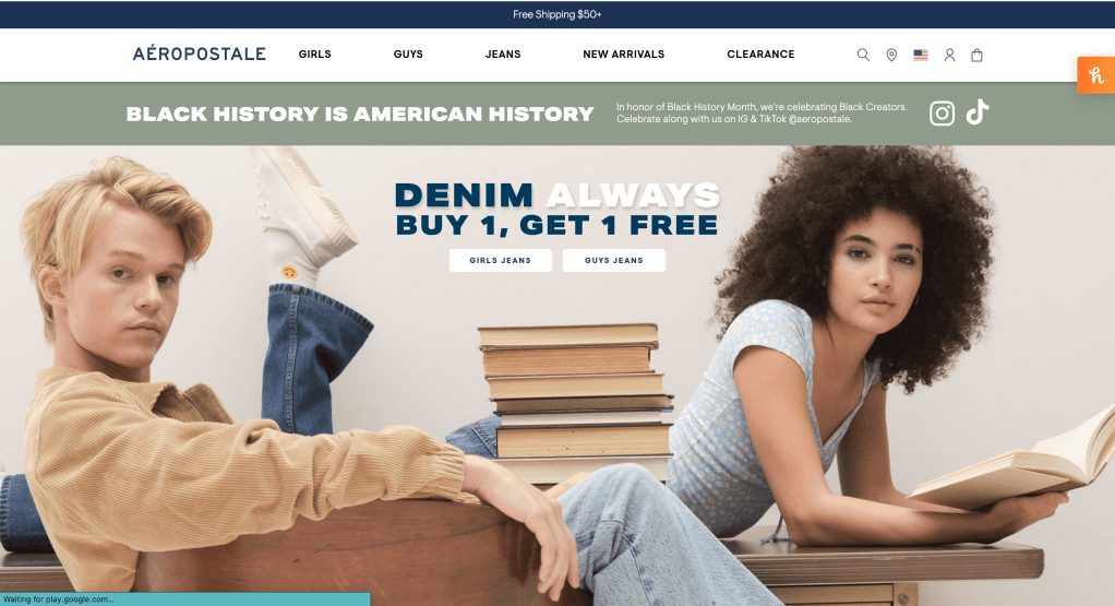
Aeropostale defines itself as, “a specialty retailer of high-quality denim and fashion basics offered at compelling values in an innovative and exciting store environment. Through the brand’s Oneness ethos, Aéropostale embraces acceptance, empathy and respect to promote a sense of unity.” Aeropostale’s website provided me with a pleasant user experience. The user interface was minimal, modern, and clean which made it easy to navigate throughout the site. They provide the user with enough information so that they are able to quickly move throughout the site with ease, which also being sure not to overwhelm them. The content was consistently displayed in a clear, well-designed format.
For example, one of the feeling and need statements that I developed for Aeropostale’s product gridwall was:
Aeropostale’s product gridwall makes me FEEL SATISFIED, ABSORBED, and FULFILLED because my NEED for CHOICE, CONSIDERATION, and DISCOVERYis being met. Aeropostale’s product gridwall provides all products that exist within a specific category. In the girls’ tops category, users can sort by color, size, price, and top sellers. Each product image displays a model wearing the product and photographed in different poses. The options for narrowing down product results made me feel satisfied as a user.
This feeling and need statement clearly defines my feelings and needs as a user and a brief explanation as to why the site made me feel that way. In hindsight, my feelings toward Aeropostale’s UX and UI were generally positive.
Hollister

The company Hollister belongs to, Abercrombie & Fitch describes itself as, “ is a leading, global, omnichannel specialty retailer of apparel and accessories for men, women and kids through five renowned brands.” Hollister’s user experience was okay, but not the best by any means. While the user interface on most pages was modern and clean, the homepage was quite chaotic and seemingly unorganized. The style of the homepage did not exactly match the style of the rest of the site. The user experience was also inconsistent. Some features provided a better user experience than others.
For example, one of the feeling and need statements that I developed for Hollister’s typography was:
Hollister’s typography makes me FEEL PERPLEXED, FRAZZLED, and WITHDRAWN because my NEED for CONSISTENCY, CLARITY, and STABILITY is NOT being met. Hollister’s typography is consistent across most pages on the site. However, the homepage typography is inconsistent with the rest of the site. Each category seems to have a typeface of its own, which creates a disorganized user interface. The typography makes me feel perplexed due to the lack of consistency throughout the website.
This feeling and need statement clearly defines my feelings and needs as a user and a brief explanation as to why the site evoked those feelings. Looking back on my experience, my feelings toward Hollister’s UX and UI were mixed. Though most were positive, there were a few negative feelings that were evoked as a result of using the website’s different features.
Summary
Finding the right words to describe exactly what you feel and need can be challenging. Author Susan David explains, “…naming our emotions — what psychologists call labeling — is an important first step in dealing with them effectively. But it’s harder than it sounds; many of us struggle to identify exactly what we are feeling, and often times the most obvious label isn’t actually the most accurate.” However, though it is a challenge it is still significant information that can not be left out. Without understanding the feelings and needs of our users, designers will not know how to effectively design for them or how to solve any problems that may already exist.
If a user has positive emotions, the designer did their job. If a user has negative emotions, the designer still has work to do. Subconsciously, all users want to do with a product is have their needs met. Having a background in psychology can provide a designer with valuable insight.
Sources
https://uxdesign.cc/the-psychology-of-ux-design-859439bc8a32
https://hbr.org/2015/11/the-new-science-of-customer-emotions
https://www.aeropostale.com/s/aeropostale/human-resource/hr-about-us.html
https://corporate.abercrombie.com/our-company/about-us/company-history
https://hbr.org/2016/11/3-ways-to-better-understand-your-emotions

Leave a comment