
What is Usability Testing?
Usability testing is a way of assessing a product’s efficiency in the field of user experience. Author, Kate Moran explains the process, “In a usability-testing session, a researcher (called a “facilitator” or a “moderator”) asks a participant to perform tasks, usually using one or more specific user interfaces. While the participant completes each task, the researcher observes the participant’s behavior and listens for feedback.” This method is often used prior to a product’s redesign. By working one-on-one with a user as they interact with the product, you are able to hear their thoughts and reasoning behind their decision-making. You are also able to identify problems with the product as they interact with it.

My Usability Test
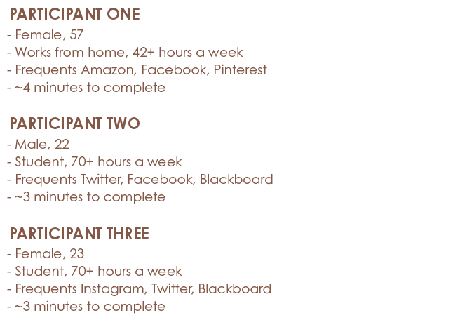
I recently conducted a usability test on The Edge Fitness Clubs’ website. I recruited 3 participants who all proved to be tech-savvy. After introducing each participant to the test, they each completed 5 tasks through interacting with the website. Most tasks required them to locate specific information within the website, and I was testing to see how long each task would take them, and any notable comments they made while they completed the tasks.
Results
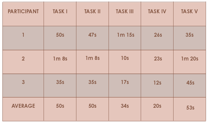
Each participant completed all of the tasks in less than 5 minutes total. Their tech savviness and understanding of common web trends helped them to locate the information. However, the current organization of content and information on the website proved to be confusing at times. Most pages have no real hierarchy of information, and it is all just seemingly thrown on the page and left there for users to figure out. The navigation also proved to be confusing at times due to its overwhelming popups that lacked consistency throughout the site.
Recommendations
I made several recommendations for the Fitness Classes page, Edge Kids page, Supplements page, Personal Trainers page, and overall navigation. I suggested that the Fitness Classes page be reorganized and that each class got a page of its own with relevant content (i.e. schedule, definition, level of difficulty, class size, etc.). I also suggested that the Edge Kids page be more noticeable. Most gyms do not offer children’s programs so I think The Edge Fitness Clubs should increase their advertising of it to attract new members and notify existing members. Additionally, I suggested a reorganization of the Supplements page. The content is currently organized in a vertical manner, rather than horizontally like is common among most other websites. I also suggested a reorganization of the Personal Trainers page that proved to be a challenge for users to navigate and locate specific information. The navigation should also be reorganized, and the popups need to be redesigned as well. Because there is a lack of consistency, it is confusing for users to have to adjust to each of the different dropdown menus.
Summary
Though most information was quickly located by the participants in this study, it does not necessarily mean that the website could not benefit from a redesign. If the information was organized more clearly, it would be even easier for users to locate their desired information.

Leave a comment