A General Introduction
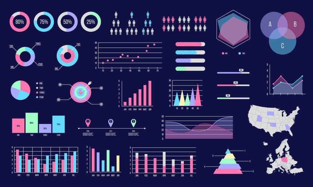
IBM defines data visualization as, “…the visualization is the representation of data through use of common graphics such as charts, plots, infographics, and even animations.” Though it may seem like something that only people in analytics and statisticians will use, it can be used for a variety of purposes. Its core purpose is to visualize data or information to be presented to an audience for a general understanding of a specific topic.
The History of Data Visualization
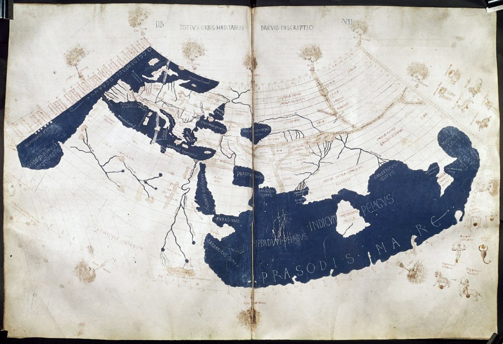
Because we currently live in the world of technology, it is a common assumption that data visualization is a concept that was recently developed. However, this couldn’t be farther from the truth! In his article, “A Brief History of Data Visualization” author Michael Friendly explains that data visualization is rooted deep in history through things like cartography, astronomy, collection of social data, tracking illnesses, and much more.
Friendly outlines the advancements of data visualization through history, starting in the 1600s all the way to the 2000s. Some of the most impactful advancements include the reproduction of data images in the 1700s, continuous shading in the 1800s, graphics entering textbooks in the 1900s, and the rise of representation from 1950 to 1970. This rise of representation was brought about by John W. Turkey and his “landmark paper” demanding the recognition of data visualization, Jacques Bertin and his organization of graphics, and the rise of computer processing of data (Friendly).
Technology’s Impact on Data Visualization
Needless to say, the progression and growth of technology have had a momentous impact on the advancement of data visualization. But have all of the impacts been for the better? For the most part, technology has advanced seemingly at the speed of light. In some cases, it is near impossible to understand each and every advancement that has been made as well as the impacts that result from them.
The advancement and development of data visualization have a similar effect. Once data visualization could be done through computers, it became even more of a challenge to keep up with all of the different advancements that were being made. Additionally, when computers are brought into almost any situation, things begin to feel a little less human. In this case, the numbers were no longer being processed by people, but by a computer program. Because of this, it can become easy to forget that the data that is being processed has to do with actual people, with “living touchpoints” as is mentioned in the “History of Data Visualization” presentation.
However, technological advancements have not only had negative impacts on data visualization. It has also provided us the ability to process data at a much quicker pace, access to new and improved tools to make processing data easier, and provided larger access to different data sets (“History of Data Visualization”). Author Richard Farnworth explains the benefits, “With modern technology, visualizing data has never been easier. A few clicks of the mouse, can more or less instantly turn a huge table of raw numbers into a visually appealing and easy to interpret diagram. Graphic data provides a high-speed shortcut to creating understanding and getting your point across.” The benefits of technological advancements in data visualization are immeasurable.
What Makes Data Visualization “Good?”
If you do a quick Google search, you’ll be bombarded with a million and one articles about what makes a “good” data visualization chart. You could spend your time going through each and every article to see what each author or company has to offer about the general things a data visualization chart has to include to make it effective. OR you could read my summarized version here (that also inserts my own opinion as well).
If you’ve decided to stay and read what I think makes a good chart, yay! So, here we go:
- A “good” chart considers the audience
A good chart doesn’t assume that the entire audience viewing the chart is experts on the topic it is presenting information on. It includes necessary context and keys to help the audience make sense of the information that they are looking at. It is also not overwhelming the audience with way too much information but considers how much the audience is generally able to digest without being overwhelmed. Less is more, so be sure to remove anything that does not provide the audience with valuable information.

- A “ good” chart uses the right tools
A good chart should represent the information in the best way possible. This means using the proper charts, correlations, and comparisons to represent your data. If you use the incorrect chart to represent your data, it could confuse your audience and cause potential misinterpretation of your data. Not good! Be sure to do the necessary preliminary research to help you determine the proper chart, correlations, and comparisons to represent your data correctly.

- A “good” chart is pleasing to look at
A large portion of data visualization is the visual appearance. I mean, the word visual is in the name, right? Color and composition can have a lot to do with a chart’s visual appeal. Using the right colors to represent your information, and presenting it in the right composition so that the entire visualization is even and not overwhelming can do a lot!
Where Do I Stand?
Having a background in graphic and interactive design, I am very partial to a pretty visualization. However, this does not mean that I throw caution to the wind and forget everything else that makes a good chart. I think visualizations with good color theory are one of the largest groups of visualizations that I strongly respond to. An appealing, well-balanced color palette will always draw my eye in, yet it’s the presentation of the information that makes me stay. I always follow the “less is more” philosophy, and believe when information is well-balanced in a digestible amount it allows me to better understand what the chart is trying to convey.
What Do You Think?
Do you agree with my points of what makes a “good” chart, or what draws you in for a visually pleasing chart? Share your thoughts on data visualization!

Leave a comment