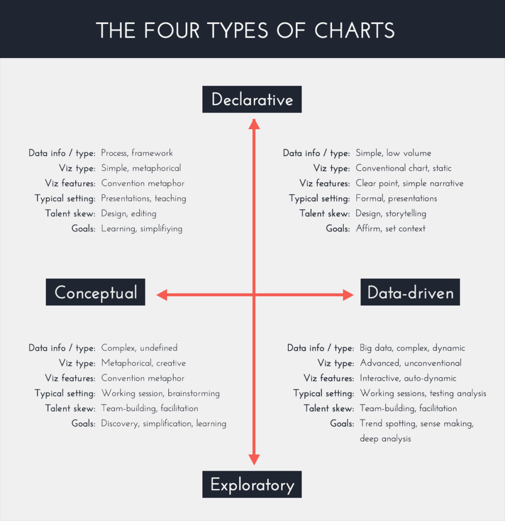
Introduction to the 2×2 Grid
Data visualization is a field that is encompassed by many different fields of study, and styles of design. However, anything that exists under the umbrella of data visualization falls within one of the categories of a 2×2 grid (shown above) that represents information visuals. The four types of information visuals are:
- Conceptual-Declarative
- Conceptual-Exploratory
- Data-Driven-Declarative
- Data-Driven-Exploratory
I know this may seem like a sort of foreign language to those who do not have an existing familiarity with the foundation of data viz, so let me explain!
Conceptual-Declarative
The conceptual-declarative quadrant of the grid can also be described as the “idea illustration” quadrant. The key word of this quadrant is simple. Although the information and data they may be presenting may be a bit complex, the visualization itself is very simple. Author, Daniel Mullins explains, “This type of visualization is used to present processes and frameworks with the aim of simplifying an otherwise complex concept.” The type of visualizations that fall within this quadrant call upon metaphors to simplify complex ideas for easier audience understanding.
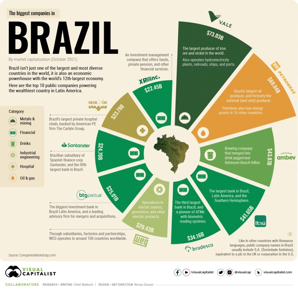
This is an example of a conceptual-declarative visualization that presents the biggest companies in Brazil. Each company is represented by a segment of the circle and the size of the segment correlates to its size compared to other companies. The visualization also provides a brief description for context to explain what each company does. We can see that this visualization has taken a lot of complex data and information and simplified it for easier audience understanding.
Conceptual-Exploratory
The conceptual exploratory quadrant can also be described as the “idea generation” quadrant. These visualizations are more commonly used in more informal settings and do not have to be entirely refined. Collaboration is also welcomed in this quadrant and visualizations can be developed through brainstorming sessions. Mullins explains, “This type of visualization is typically used in group brainstorming sessions to gather as many diverse points of view as possible.” It is common to see visualizations in this quadrant that are scribbled in sketchbooks, sticky notes, on whiteboards, and things of that nature.
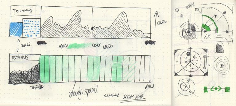
This example of a conceptual-exploratory visualization highlights the informal, unrefined nature of the quadrant. The individual developing this visualization is working through ideas, sketching, and generating ideas to represent the data at hand. Because the structure is informal here, it is likely that this visualization will not be presented to a large audience and will likely rather be used for collaborative group settings to facilitate idea generation, as the quadrant says.
Data-Driven-Declarative
The data-driven-declarative quadrant is also described as the “everyday dataviz” quadrant. In other words, these visualizations could be presented without any verbal context accompanying them, and the audience would still be able to understand the information it is presenting. In order for this to be the case, the data sets are often smaller and the charts often take simpler forms in this category. Mullins explains, “These are simple charts and graphs used in presentations and reports to communicate key findings. They consist of line charts, bar charts, pie charts, and scatter plots.” Because these charts are used to communicate insights and findings, it is crucial that they are simple enough to convey the information efficiently.
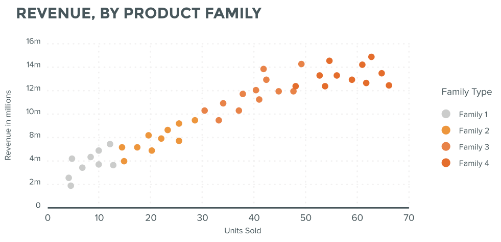
This example of a data-drive-declarative visualization highlights the revenue, by product family for a business. You can see the data set is fairly small and does not try to represent more than trends or patterns. The scatter plot simply and efficiently presents the information to the audience for them to quickly and easily interpret the information and data the visualization is presenting.
Data-Driven-Exploratory
The data-driven exploratory quadrant can also be described as the “visual discovery” quadrant. The exploratory style truly comes to life in this quadrant, because these visualizations are often interactive and dynamic. Mullins explains, “This is the most complicated quadrant and tends to occur during the analysis stage of a project. Data scientists and analysts will use numerous types of charts and statistical models to mine the data for patterns, trends, and anomalies. These charts change often as parameters are adjusted and new data sources are added.” These charts change frequently, and in his TedTalk, David McCandless describes them as “living” visualizations because they do not stay stagnant and are constantly being updated to represent the most current data sets.
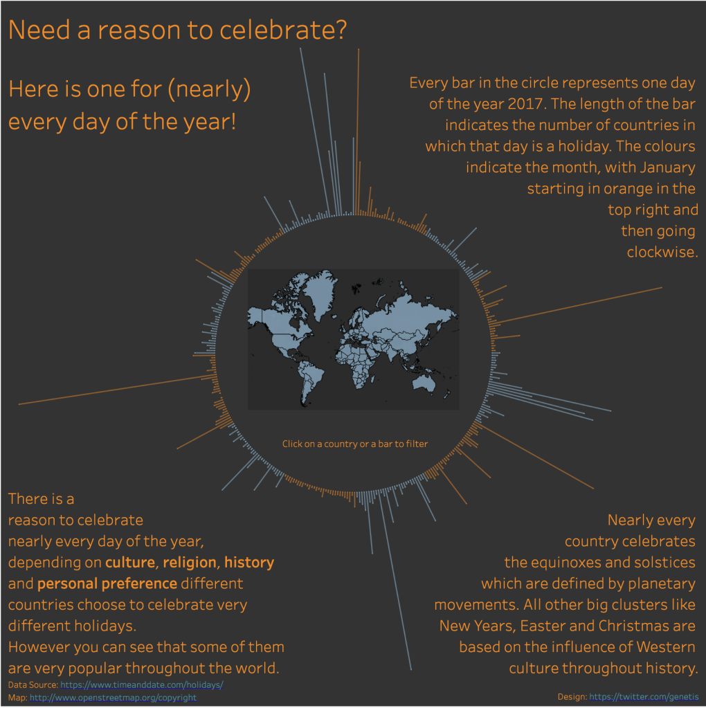
This example of a data-driven-exploratory visualization provides the interactive style of the quadrant. This visualization presents a chart where each line represents a day of the year, and the longer the line is the more people around the world celebrate that day. You can filter the chart by country, or click on a bar to get even more specific information depending on what you, the viewer, are looking for. Here is the link if you would like to check it out for yourself!
In Conclusion
Data visualization is an extremely versatile field that can fit the needs of your project no matter what it may be. Although it may seem a bit complex from the outside looking in, just a bit of research can provide you with insights you can take with you and utilize in your future. I’ll leave you with a quote from David McCandless’ TedTalk! “If you combine the language of the eye with the language of the mind, which is about words and numbers and concepts, you start speaking two languages simultaneously, each enhancing the other.”

Leave a comment