Maps and Data Visualization
Maps have been around for thousands of years, and they are still a popular tool used to this day. They help us to get from place to place, to have a spatial awareness, and understand more about specific locations. “Basic maps are commonly used to display multiple locations, show paths or connections between different locations, or demonstrate quantitative values related to location…” (The University of Tennessee Knoxville). Maps can also be utilized as a form of data visualization, and three types that are commonly used in this field are, choropleth maps, symbol maps, and locator maps.
Choropleth Maps
Choropleth maps can be used to visualize variation throughout a specific location. They typically “display divided geographical areas or regions that are colored, shaded or patterned in relation to a data variable” (The Data Visualization Catalogue). You will commonly see choropleth maps used around the time of the presidential election presenting the variation of the states’ votes.
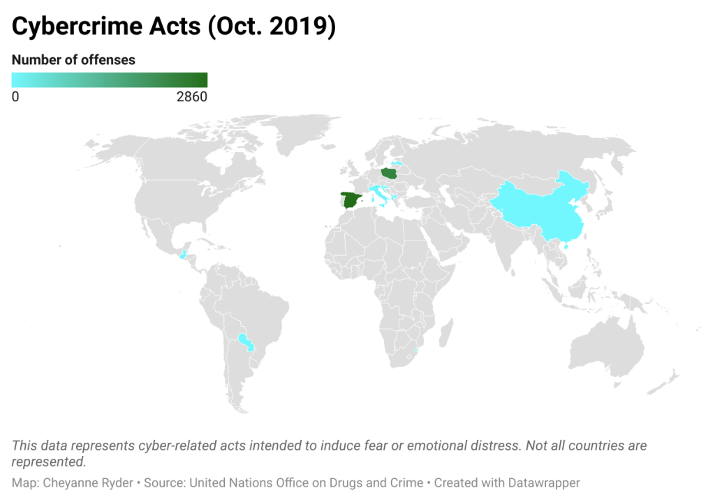
In this example, you can see the representation of cybercrime acts in certain countries. A choropleth map works well to visualize this data, but is it the best way? The variation of the color gradient allows the audience to compare the difference in the number of cybercrime acts quickly and easily.
Symbol Maps
Symbol maps show quantitative data across a geographical map. “The map contains symbols that represent values in a data set. These symbols can be of consistent size, shape and color or they can differ (in size, shape, or color) to represent variation of the value” (Tableau). Symbol maps often show specific locations that have been affected by things like natural disasters or viruses.
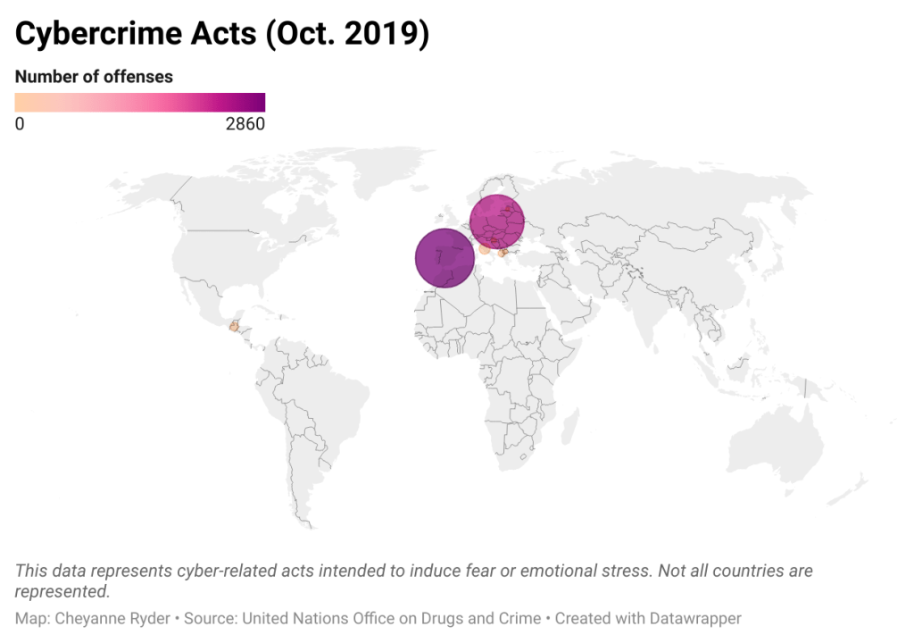
In this example, you can see the representation of cybercrime acts in certain countries, however, this time it is visualized through a symbol map. The variation in size on the symbol map allows the audience to quickly and easily differentiate the number of cybercrime acts from country to country. In my opinion, the symbol map is likely the best method of visualizing this data.
Locator Maps
Locator maps typically show a small geographic location in detail. If you have ever traveled somewhere and used something like Google Maps on your phone to see and understand where the nearest restaurant or library was in proximity to your current location, you have already seen and utilized a locator map.

Here you can once again see the representation of cybercrime acts in certain countries, but this time it is visualized through the use of a locator map. Because locator maps are typically used to show smaller geographic locations, it is not the best method of visualizing this data because it encompasses multiple countries across the world.
Moving Forward
Each method of visualizing data has strengths and weaknesses. It is important to understand the best methods for representing your data before beginning to develop a visualization. As you were able to see through the example used in this blog post, some visualization styles are stronger than others. Be sure to consider a few different methods to ensure that your audience is able to easily comprehend what you are trying to portray!

Leave a comment